Illustration / Logo Design
Joy Ice Cream Redesign
Project Type
Logo Design
Branding
Redesign
Illustration
Software Used
Adobe Illustrator
Date
2020
Process
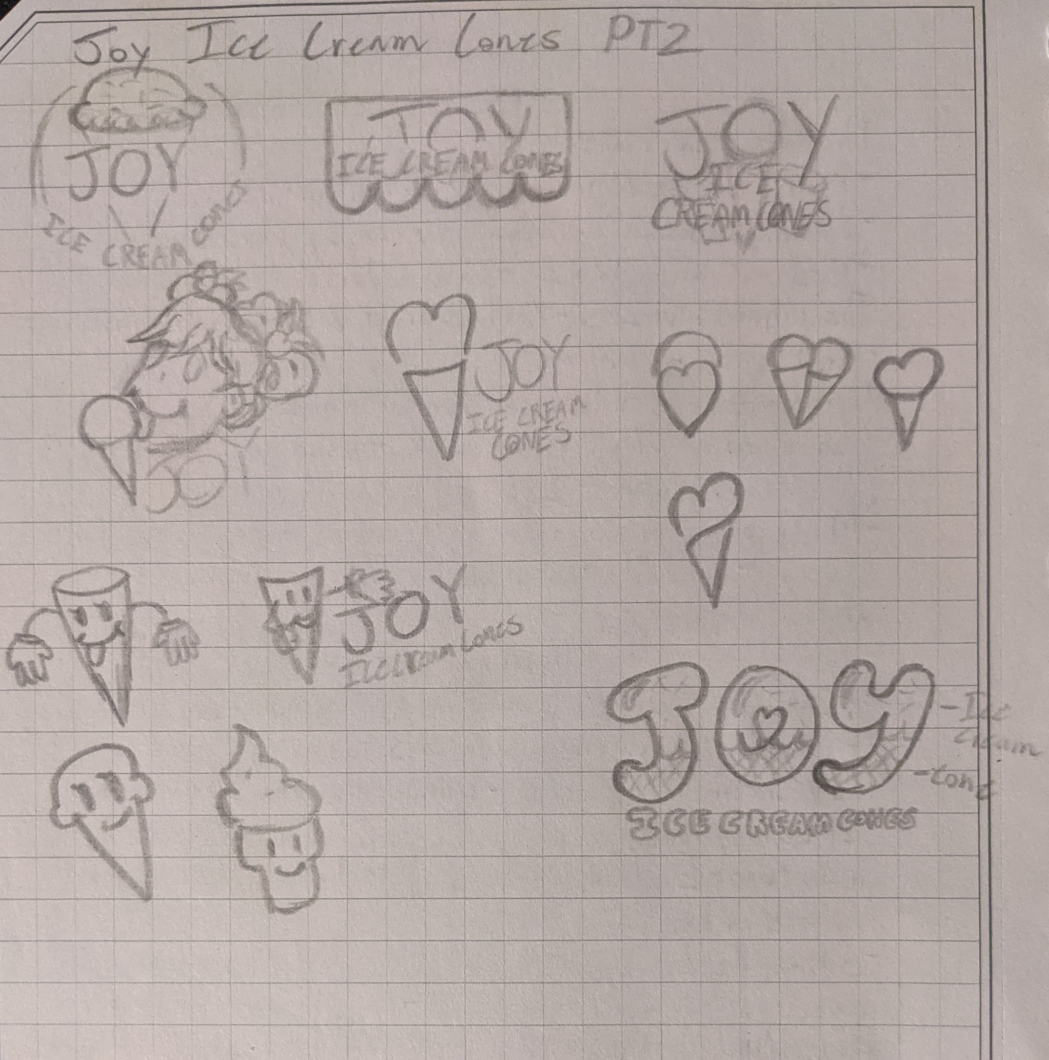
To practice my logo design, I chose to redesign the Joy Ice Cream logo. The biggest lesson that this project taught me was that I need more practice making more playful logos. I feel like the designs I made are too rigid and the illustrations either have no depth or no "softness." I also want more practice creating illustrations for food, both realistic and cartoon-ish. Next I was going to reference their website, but as I am writing this for my portfolio, they have a new website, which looks way cleaner than their old website. Their older website, had a textured background, with childish drawings of ice cream within a picture of their actual ice cream cones. In terms of layout (on my computer), the content was centered with large margins and a grid. Each element had different sizes, rounded edges, and a soft shadow behind them; much like interactable cards. The website had a childish / sketch theme to it while the new one is more bold, sleek, and modern. And like most websites with that bold, sleek, modern theme has more focus on legibility, readability, and full-width sections. I like the new website more but I wish they could have incorporated some of those childish drawings and used more creative fonts for their title on the homepage.
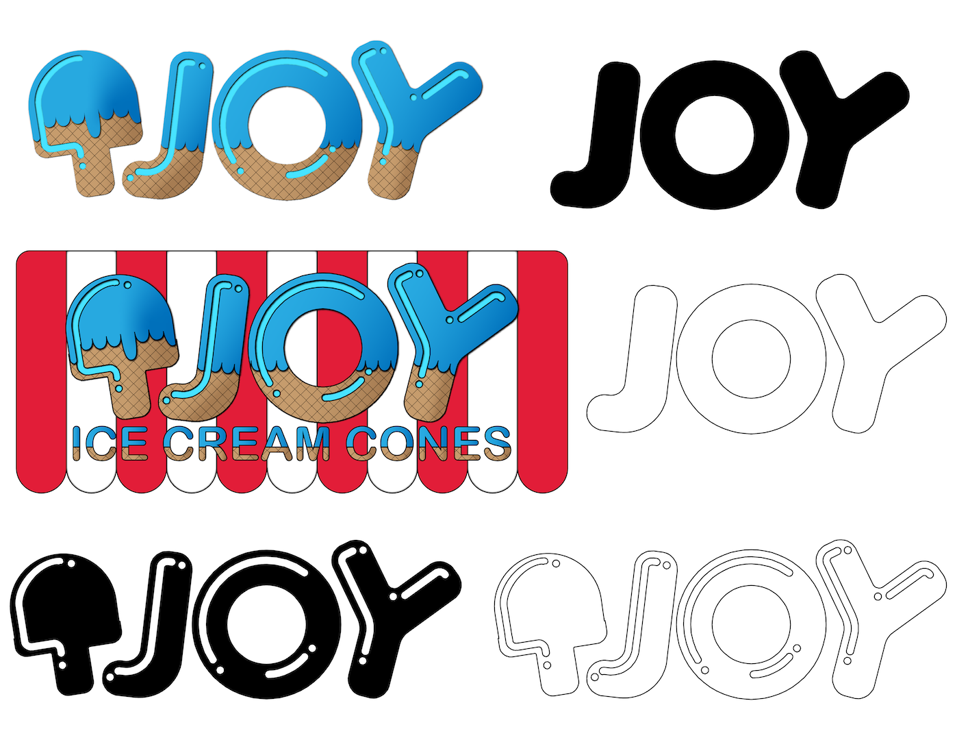
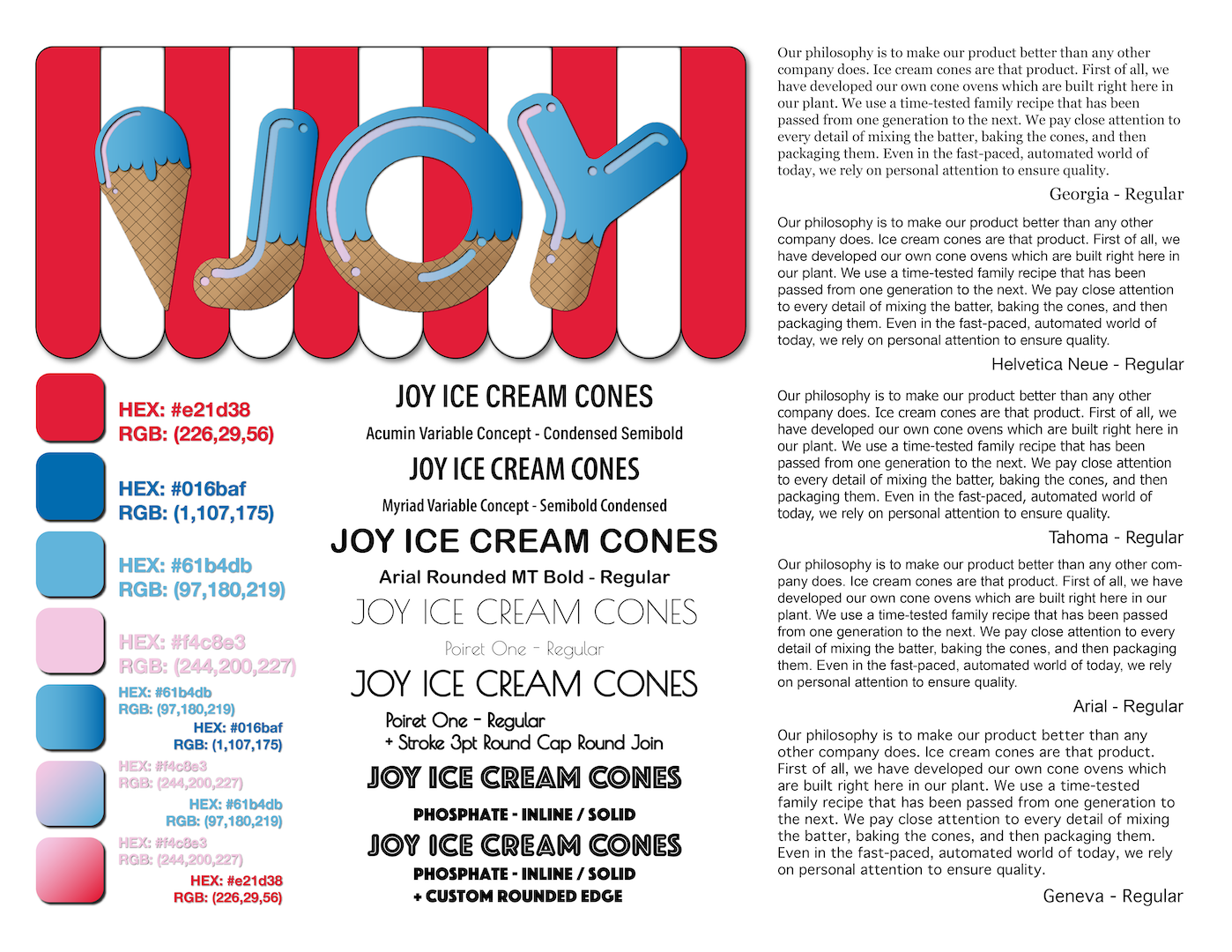
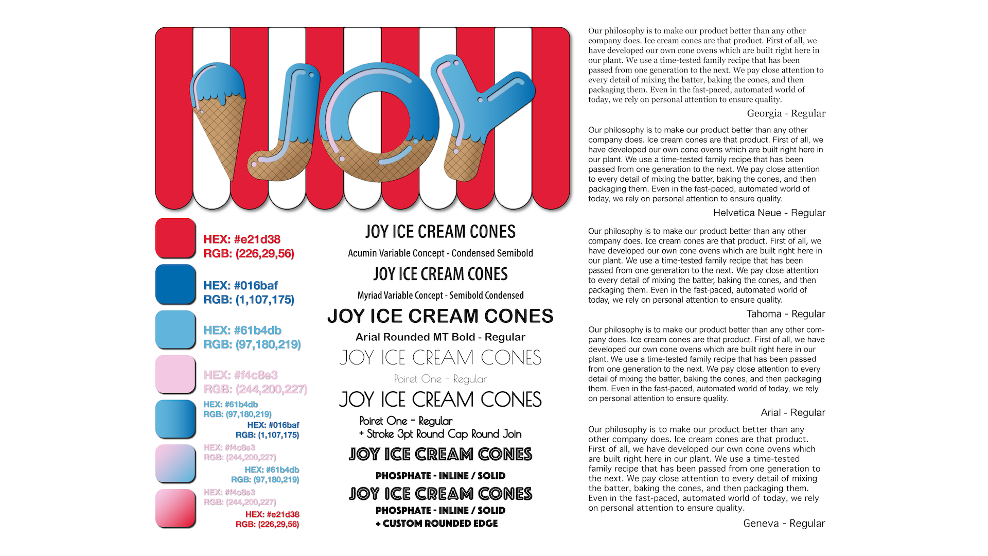
When making the Joy logo, I wanted to keep the american red, white, blue color scheme. If I remember correctly, one of the creators was a Lebanese immigrant and their flag is red, white, and green. Which could have worked, if they used a minty green but I think they wanted to pander to american business. I also don't know much of Lebanese history or the history of the Joy Ice cream cone creator, so any reason I could give for the colors of the company is only speculation. Moving on, I added a light blue and pink to experiment with. I also didn't want to stray to far off from their actual logo (Red --> Pink and Blue --> Light Blue). I wanted to keep the wordmark logo and the offset letters but change the Phosphate-like font they used. (You can see what the Phosphate font looks like below, in a list of considered titles for sections using Typography.) I started with a bubble font and modified it to look like ice cream on top of a cone. I wanted to add an ice cream cone next to the logo so that when the logo stands alone, you can tell what its subject is. In the end, I went with the Waffle cone illustration next to the rounded font, with the diagonal cuts on the bottom and the ice cream on the top. There's no stroke to the logo and there's an inner bevel where the shine would be with a pink to light blue gradient. In the background is the red and white banner that has a stroke and a light shadow. I think the final logo wouldn't be considered. I want to do this again in the future when I have a better grasp on making a playful illustration for food. I really want to be able to represent the Joy with a illustration that soft and cute. I think it fits the theme so well.
