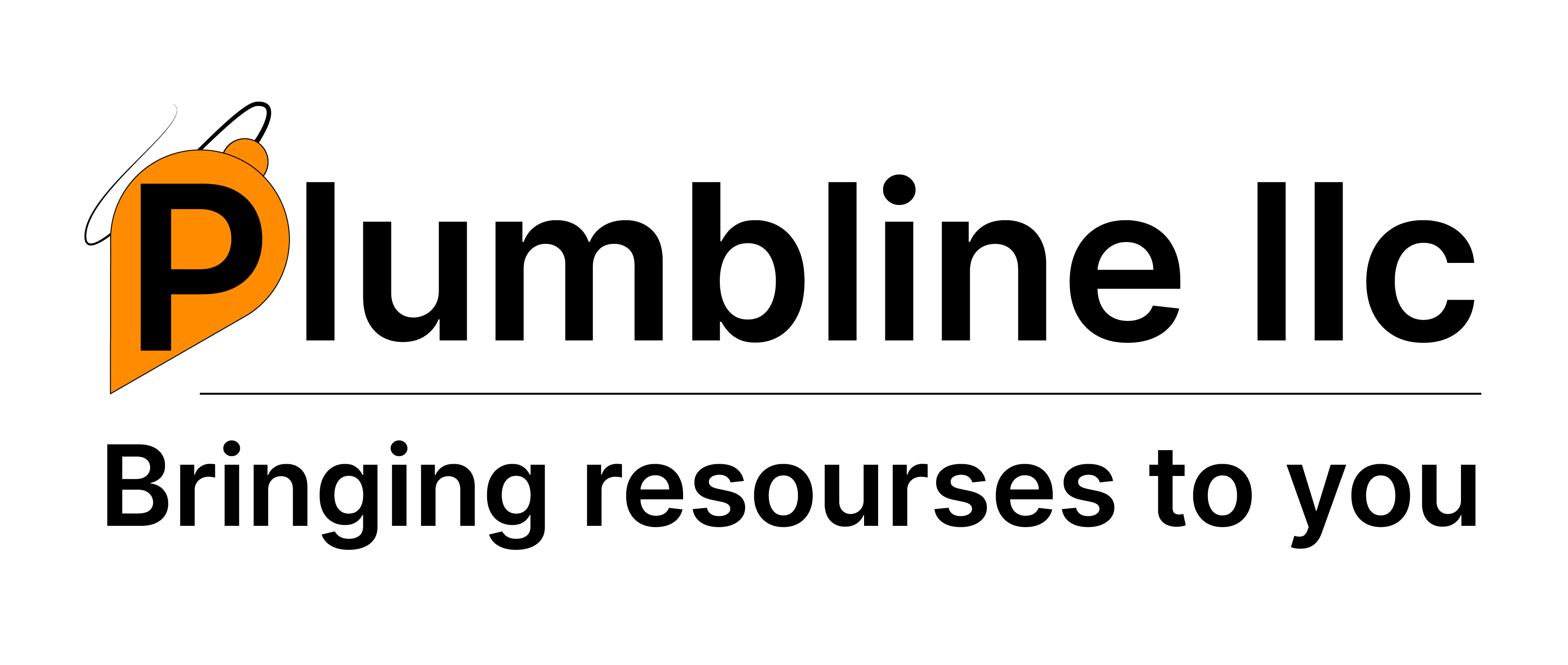
Logo Design

Plumbline LLC
Project Type
Logo Commission
Redesign
Software Used
Adobe Illustrator
Date
2021
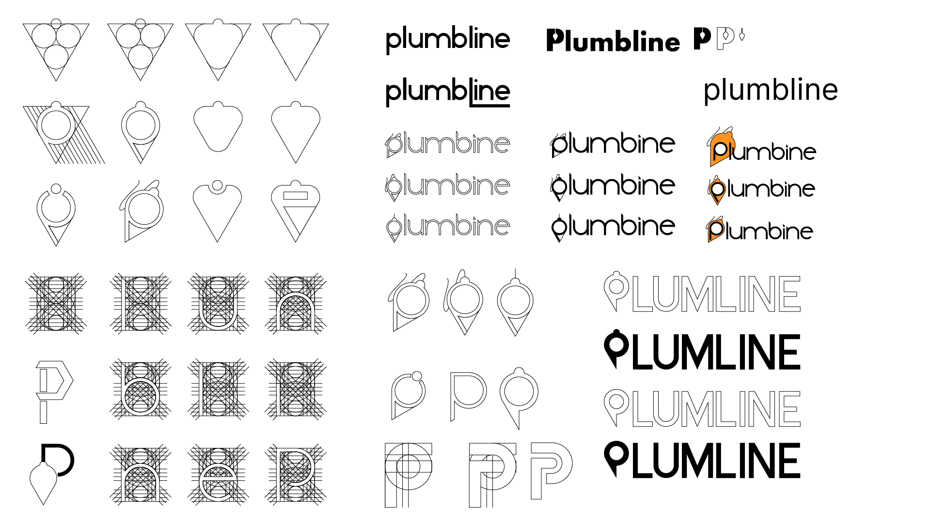
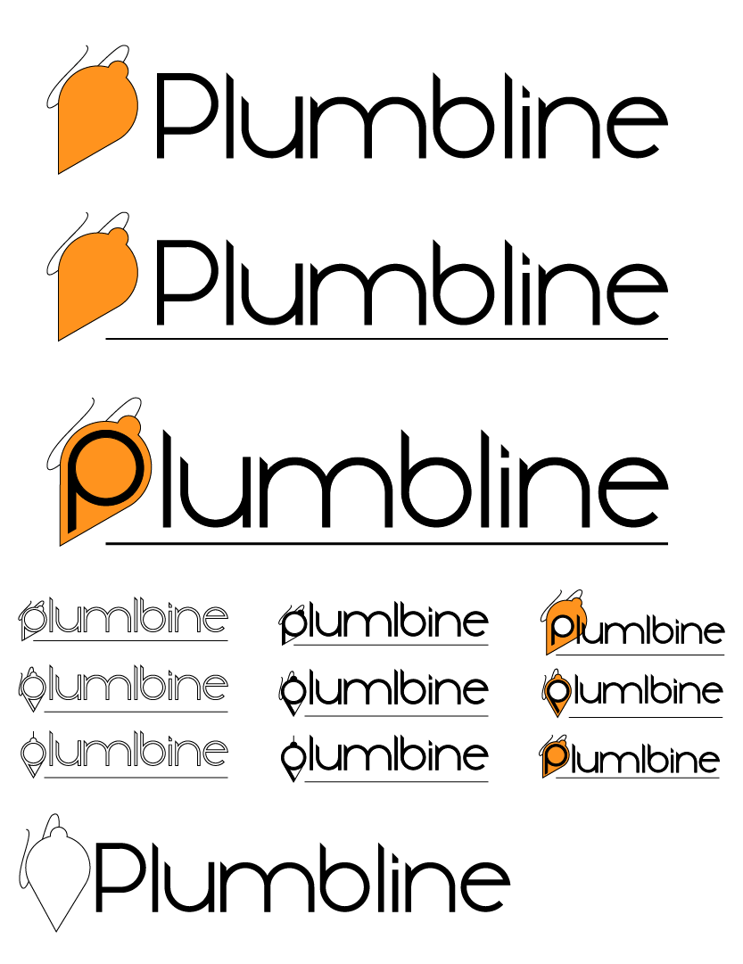
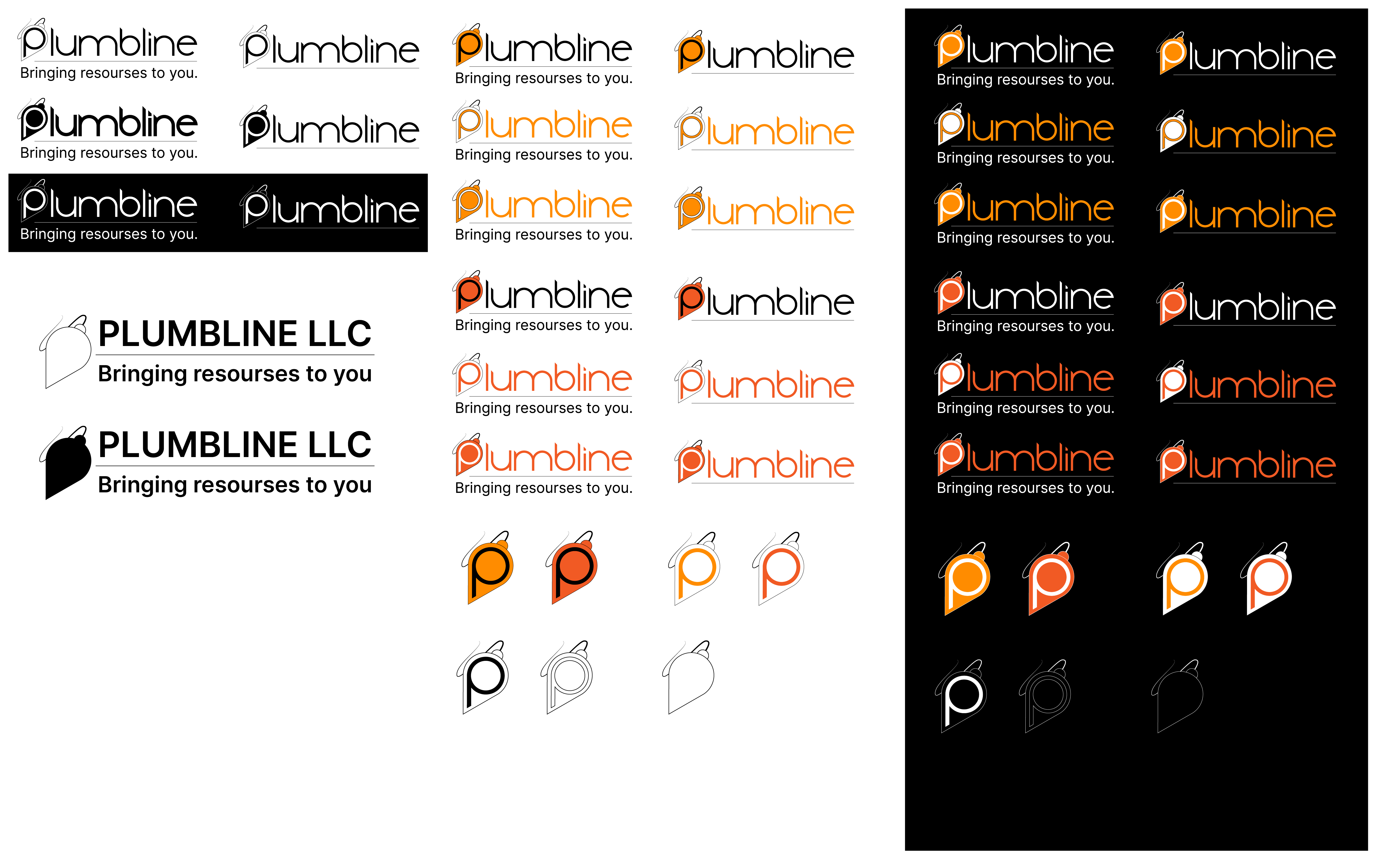
Process
Plumbline LLC is a contracting and construction company of a friend. He wanted a redesign of a logo and I decided to accept. He gave me creative freedom to come up with an idea. I think he wanted to see what I would make him. Anyways, The main thing that I wanted to keep was his symbol of the plumbline and, in retrospect, I should have also kept the symbolizism of the Human or commuication / collaboration / education but I kept it simple. Something that I also should have done is add shading and lighting to make it pop. I chose orange because of its connections to construction, success, balance, and warmth. I created the text in the first presentation based on a geometrical wireframe. However, he wanted something that was more common. So I chose Inter because of its similarity to Helvetica, a sleek and governmental typeface. I thought it would work well for a construction company, its clean, easy to read, and is bold enough to stand out. The full logo has the P within the plumbline and the rest of the text written next to it with the tagline under the separator line.