Mobile / UI / UX Design

Quinnipiac App
Project Type
Web Design
Mobile Design
UX / UI Design
Software Used
Invision
Adobe Illustrator
Adobe InDesign
Date
2019
Process
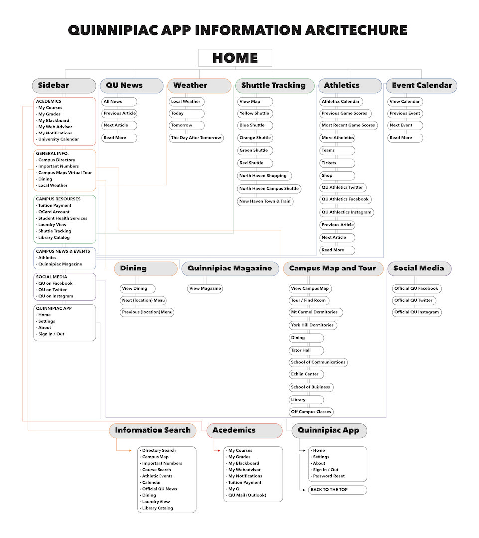
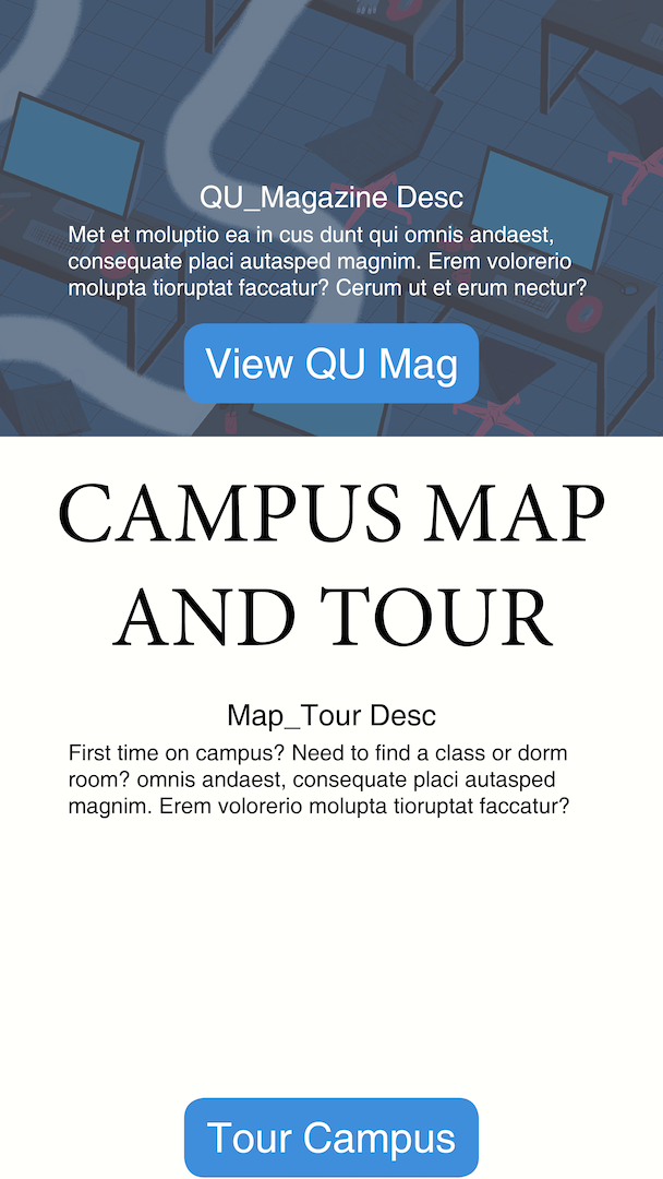
The goal of this project was to redesign an existing mobile app or mobile version of a website. It's also the first I've used Invision. (I know there is some loading issues with the Invision project. That's because I used a lot of high quality assets without considering the optimization of the viewing. I uploaded the pages of the mobile app below). So I started with the making of the Information Architecture and I didn't realize how many directories the app actually had. I knew there were many of them but seeing them all out in one place made it a bit overwhelming. Anyways, The biggest thing I wanted to add to the app was a landing page that updated people on the newest things on Campus, since the actual app didn't give much in terms of visual representation. In the Research Process link below, you can see some of the current apps' screenshots. The sidebar is the only form of navigation. I believe that the sidebar is convenient, so in my final design I kept it. Click the hamburger, you'll see the same options from the actual app.
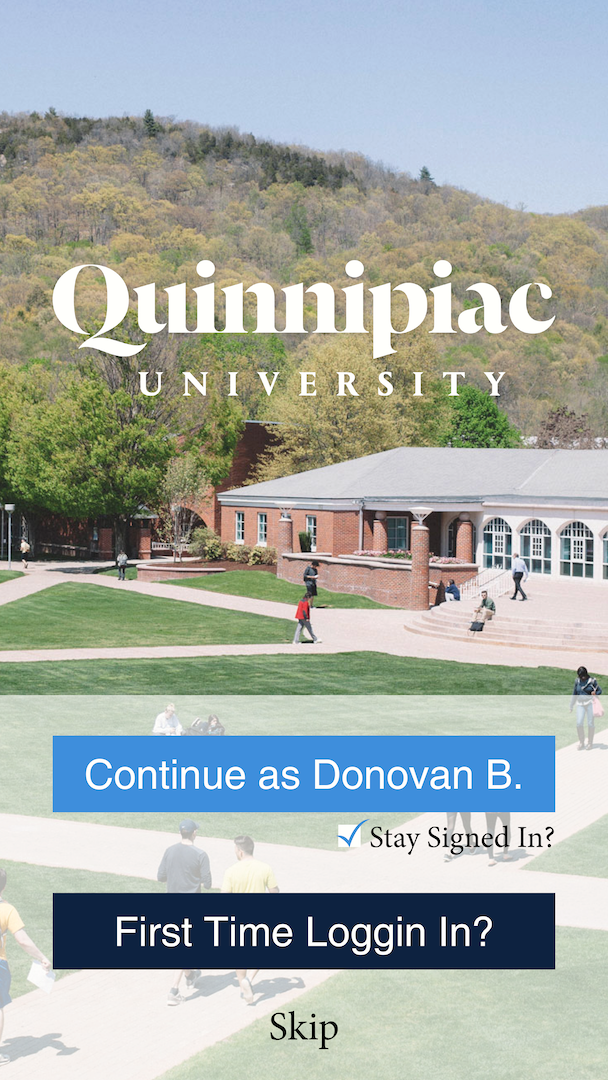
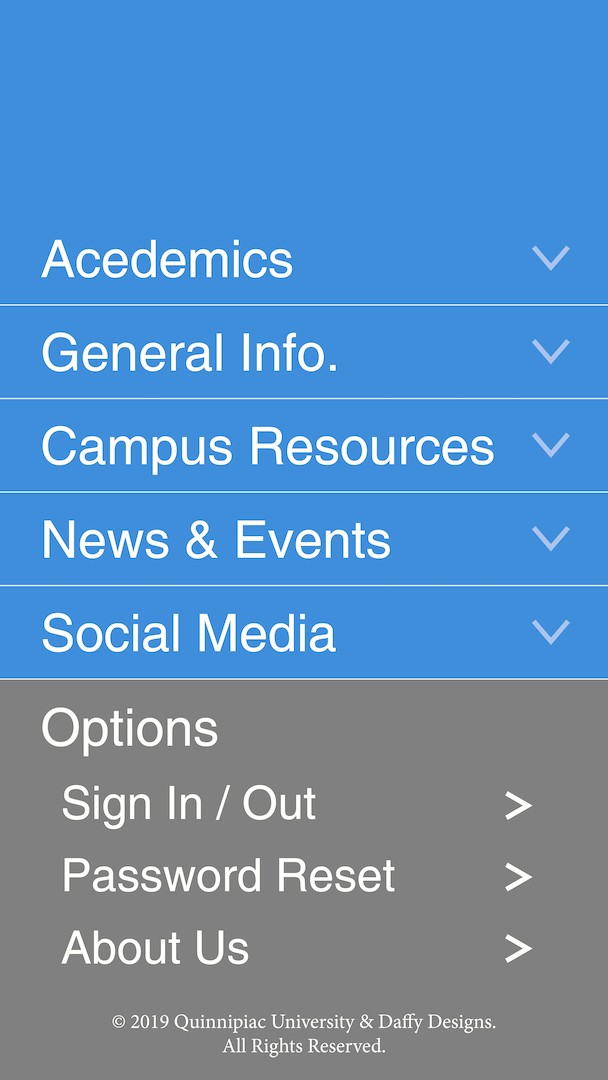
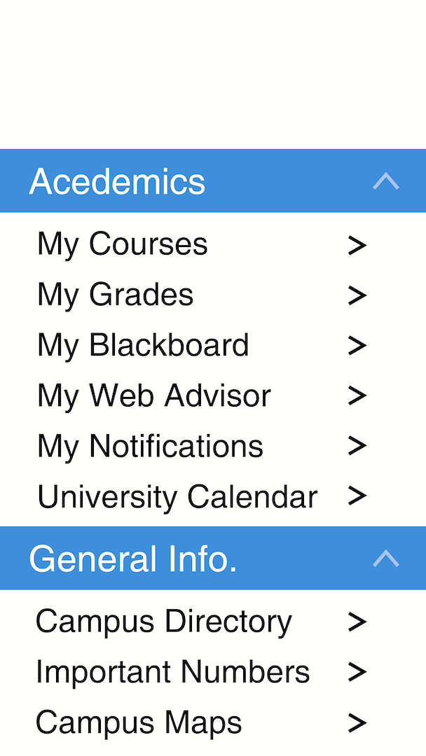
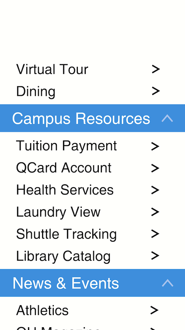

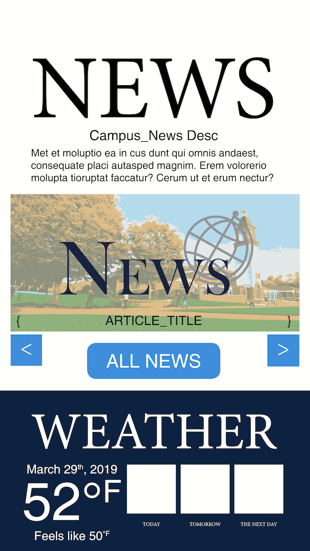
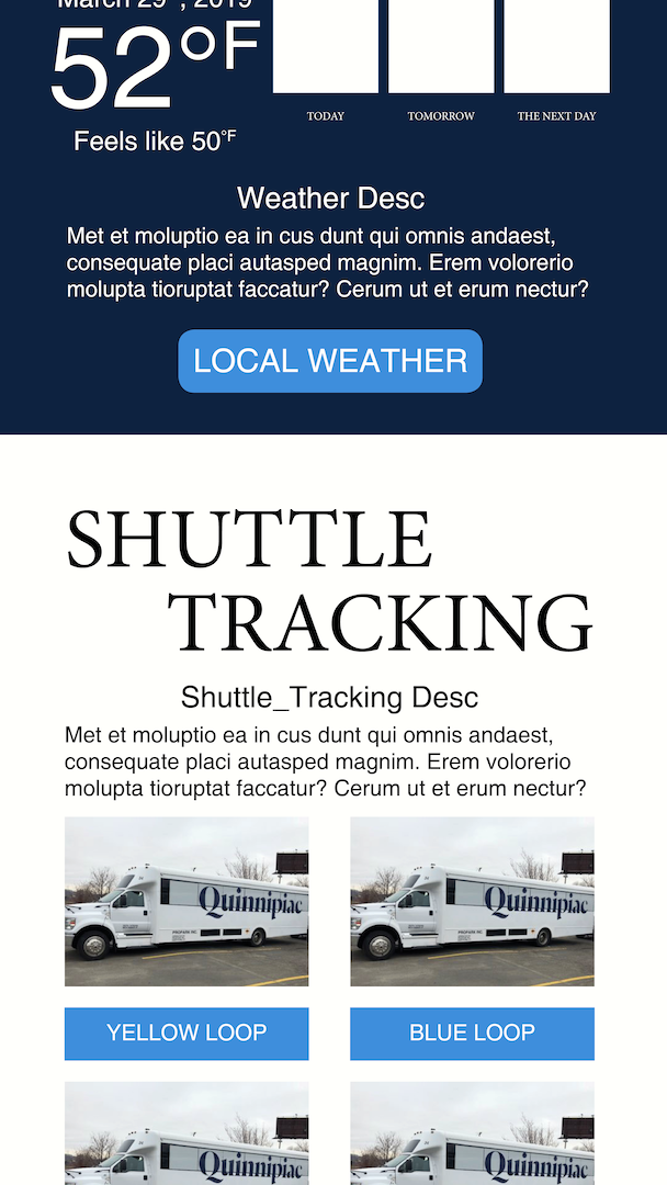
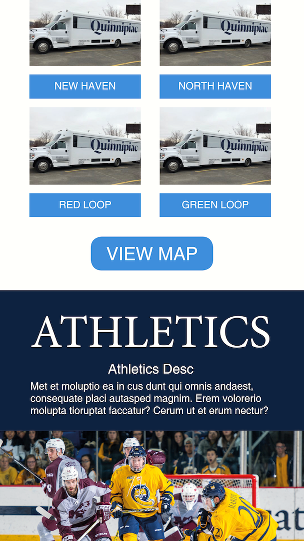
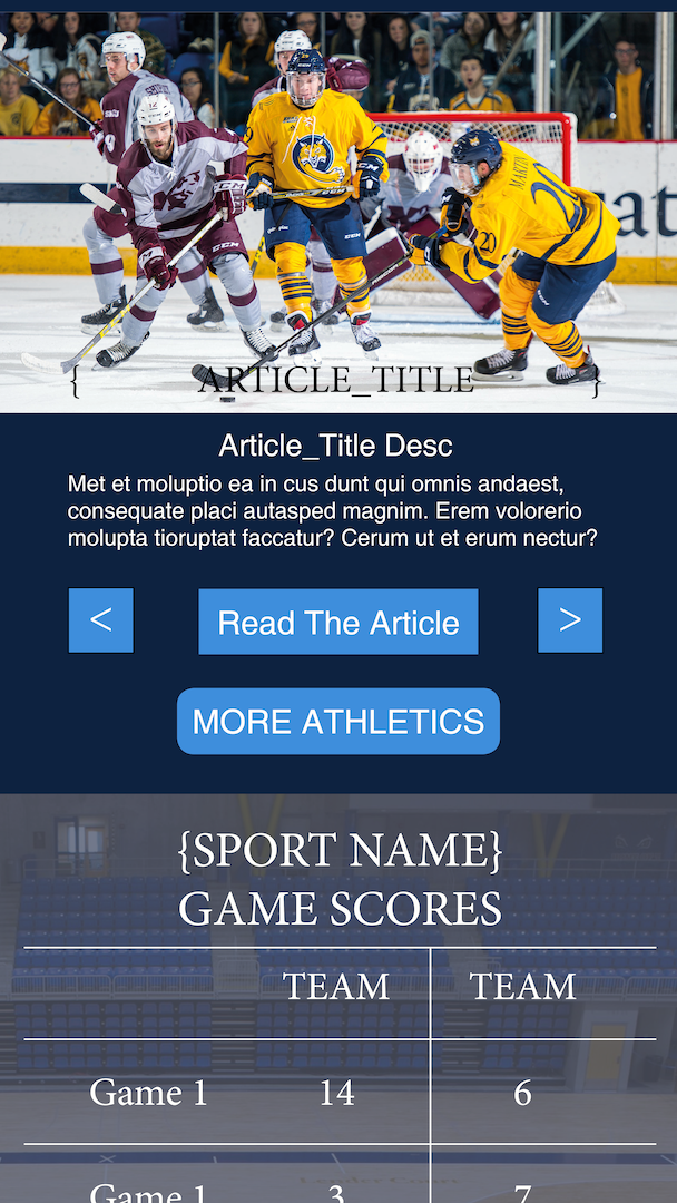
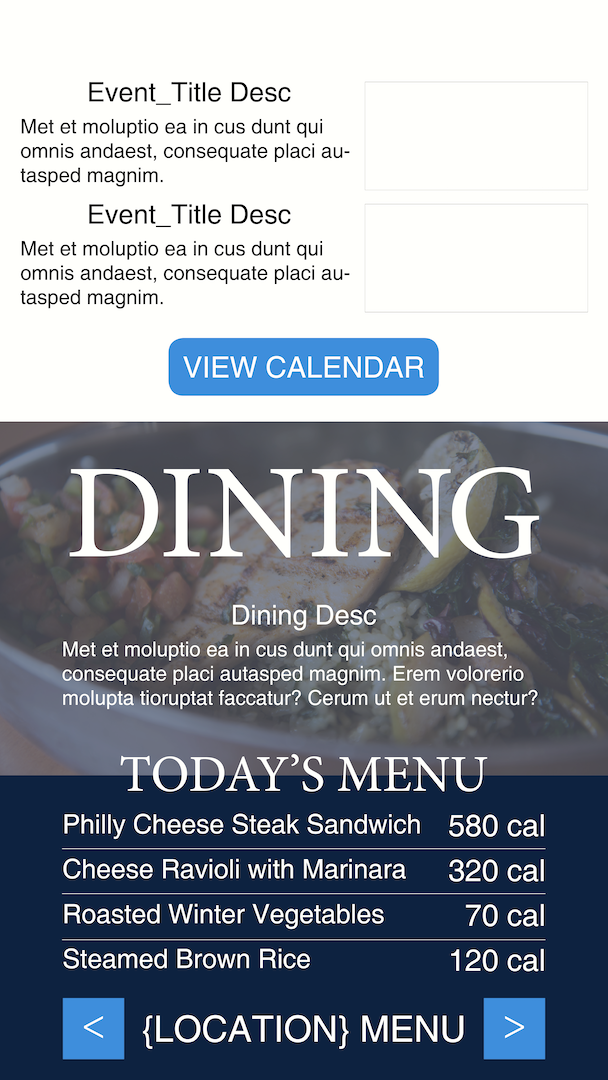
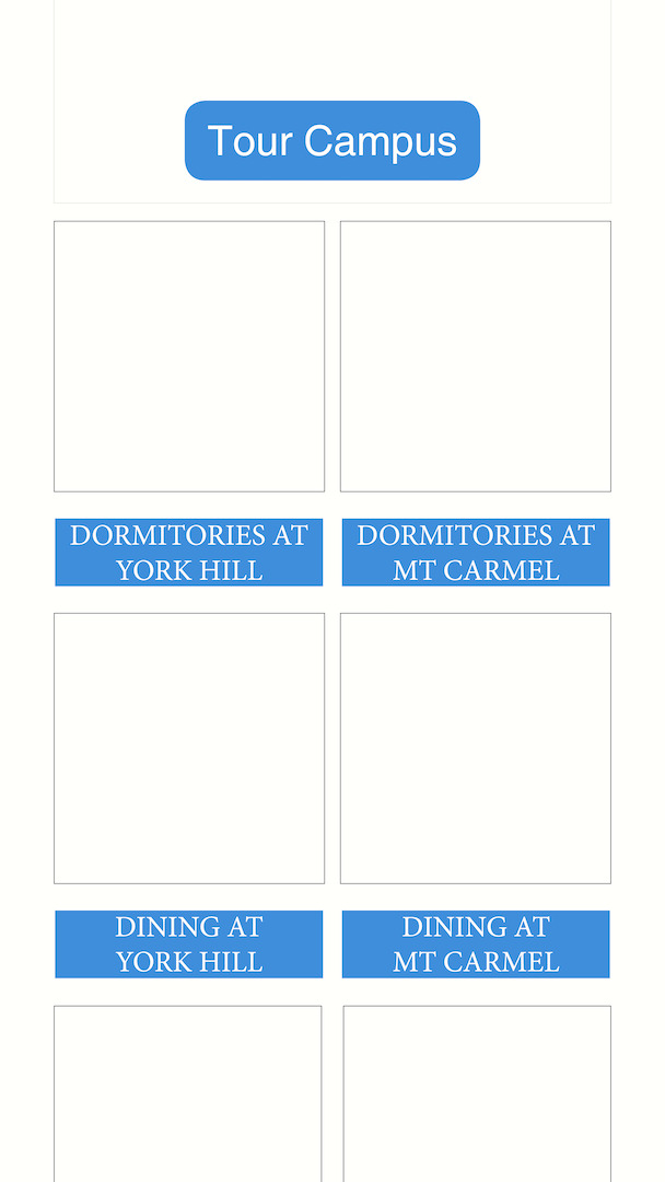
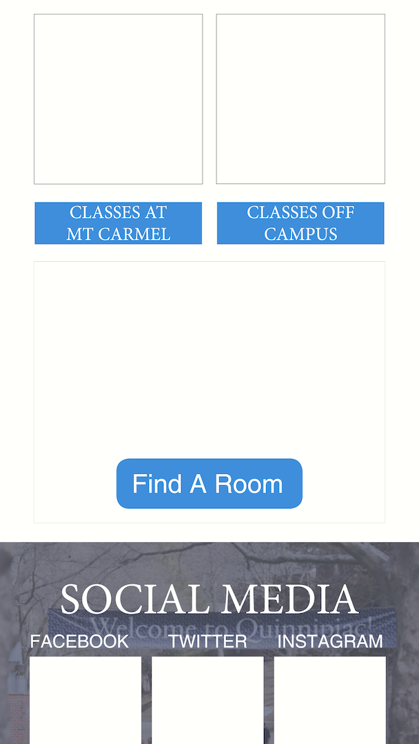
The most useful things I thought that the homepage should contain is: the quinnipiac news and events on campus, the weather, shuttle tracking (to get between campus, dorms, stores, etc.), Athletic events, Dining menus (to find any new or special meals), Quinnipiac magazine, a campus map, and then social media. Next was to get consider the color palette. I looked up the branding colors for Quinnipiac and used the dark and light blue along with white. You can see the branding information in the Research Process. Next was to make a wireframe. One of the critiques for the initial wireframe was that the elements would be to small for mobile and everything could be spaced out more. You can view the Initial Wireframe Below. In the final composition, when you click the hamburger, it would slide to the right rather than occupying part of the screen like in the mockup. For each section of the homepage, I gave them more space but I also tried to keep in mind that people might not want to be scrolling down the whole page just to get somewhere they go frequently, so I somewhat restricted most sections to the height of the display. And for the footer, there are some useful links that might not be clicked as much but are still useful, as well as, a button to go back to the top of the page, setting, about, sign-out, and a password reset.


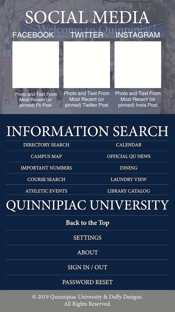


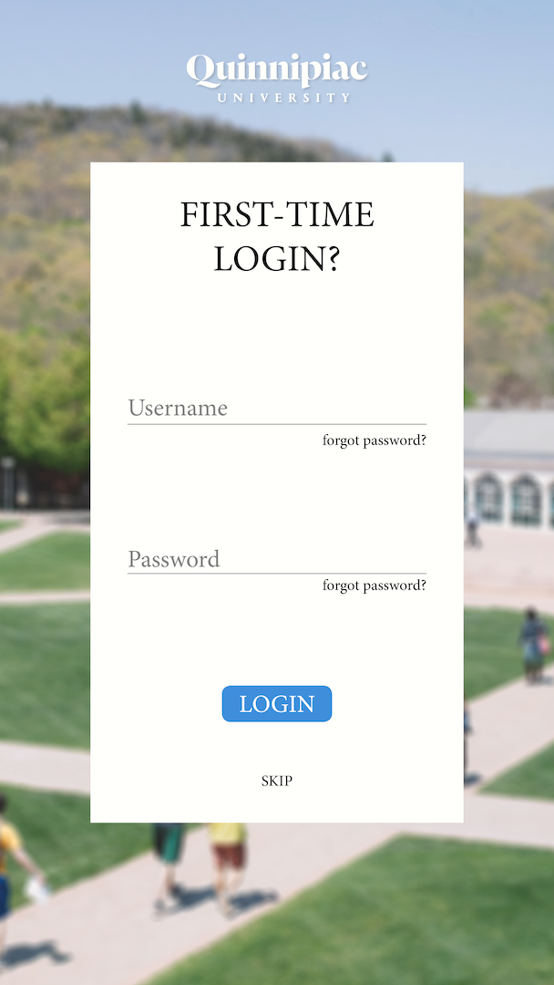
If I were to work on this again, I think first I would give myself more space to place items, even if you would be scrolling longer. I would also cut down on the sections, combining News, events, and athletics each with their individual links but in a single section. I'd combine the campus map with the shuttle tracking. And I'd keep Dining and the Magazine in their own section. On the First-time login page, it should have a "remember me" checkbox in case they don't want to auto sign-in but the user does want to keep username filled in. I think I'd also move the Quinnipiac socials to the hamburger menu. Next I would slightly rework the layout and buttons like they have on the QU website. I would also incorporate yellow elements like the main website does as well. I think dividers between the links in the hamburger menu would help as well. Although my final version didn't show a design for every link, If I had more time when I was making this, I would consider redesigning every link as well. Making the movement fluid and using shadows and darkening background elements more to give contrast to the light text on top (or vise versa). Anyways, like most things the more you work on it the more you'll want to improve and change things. There were things I could have done better and I look forward to doing more of this type of design in the future.