Web / UI / UX Design
Exposure
Project Type
Web Design
Group Project
HTML / CSS
Software Used
Sublime Text
Adobe Illustrator
Adobe InDesign
Date
2019
Process
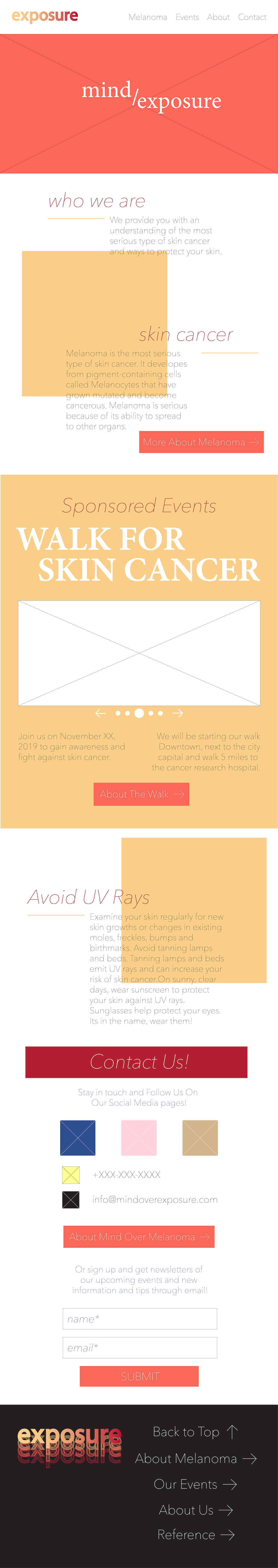
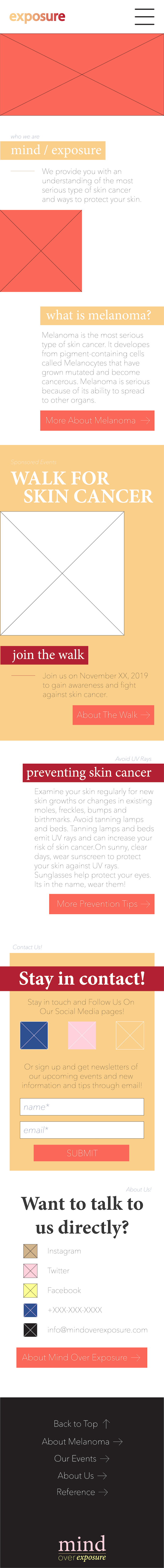
This is about the making / idea of the site. Exposure is a melanoma information (skin cancer awareness) site. It teaches the risks of Sun / UV exposure and ways to avoid or look for skin cancer. Like with all projects, I first started off with brainstorming for the logo, color, and website. Then I made a html map of how I was going to structure the code. It was the first time that I did this and it was to grasp what I was going to code visually. I think I should do this more and be mor ein depth about it to make sure I dont make mistake. Next was coming up with colors and mockups. At first I used a light color palette consisting of a tan, pink, yellow, dark blue, and white. I believe we wanted stronger colors, so in the end we used a heavy color pallete consiting of warm colors; yellow, orange, red, black, and white. I made mockups in both colors but we ended up using a design from one of my group members, then I made an Information Architecture for that mockup. Our groups final name for the site was Exposure and we keep it as a wordmark logo with the gradient of our color palette. Then finally, over Thanksgiving break, I fully coded the website in a week with just Bootstrap as the framework and her mockup as reference. One thing that I added was the flipping of the cards because I wanted the site to have some interactibility. The only problem about it was that it's not responsive.

.png)

The best thing that our group had was themeing. All of our work (excluding older versions of the site), worked nicely together. Although I don't have the process book, My teammate did a great job designing it. She used blob elements which I also used on the website and she had a great grasp of color theory and flat illustration. During the presentation, I hung up on my words and was trying not to critize our work since we were just supposed to be showing it off. I thank the girls for taking the spotlight from me, I'm still so bad at speaking in front of the class and having my thoughts come out in the right order. I always get thoughts coming in at the same time and it can be annoying. If I could work on it more, I would make the website responsive and make the pages more unique, since the structure is the same throughout the website. Except for the parts where I used the css style "position: absolute;" which was a first for me. Position is such a useful command and I use it all the time. I also think I can use it better with other styles to keep elements where they need to be regardless of window size.