Web / UI Design

Chess for Chest Fundraiser
Project Type
Web Design
Group Project
Software Used
Adobe XD
Adobe Illustrator
Blender
Slack
Date
2020
Process
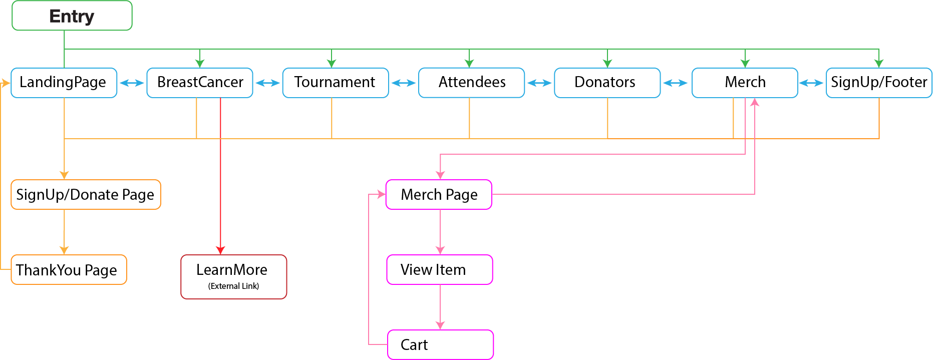
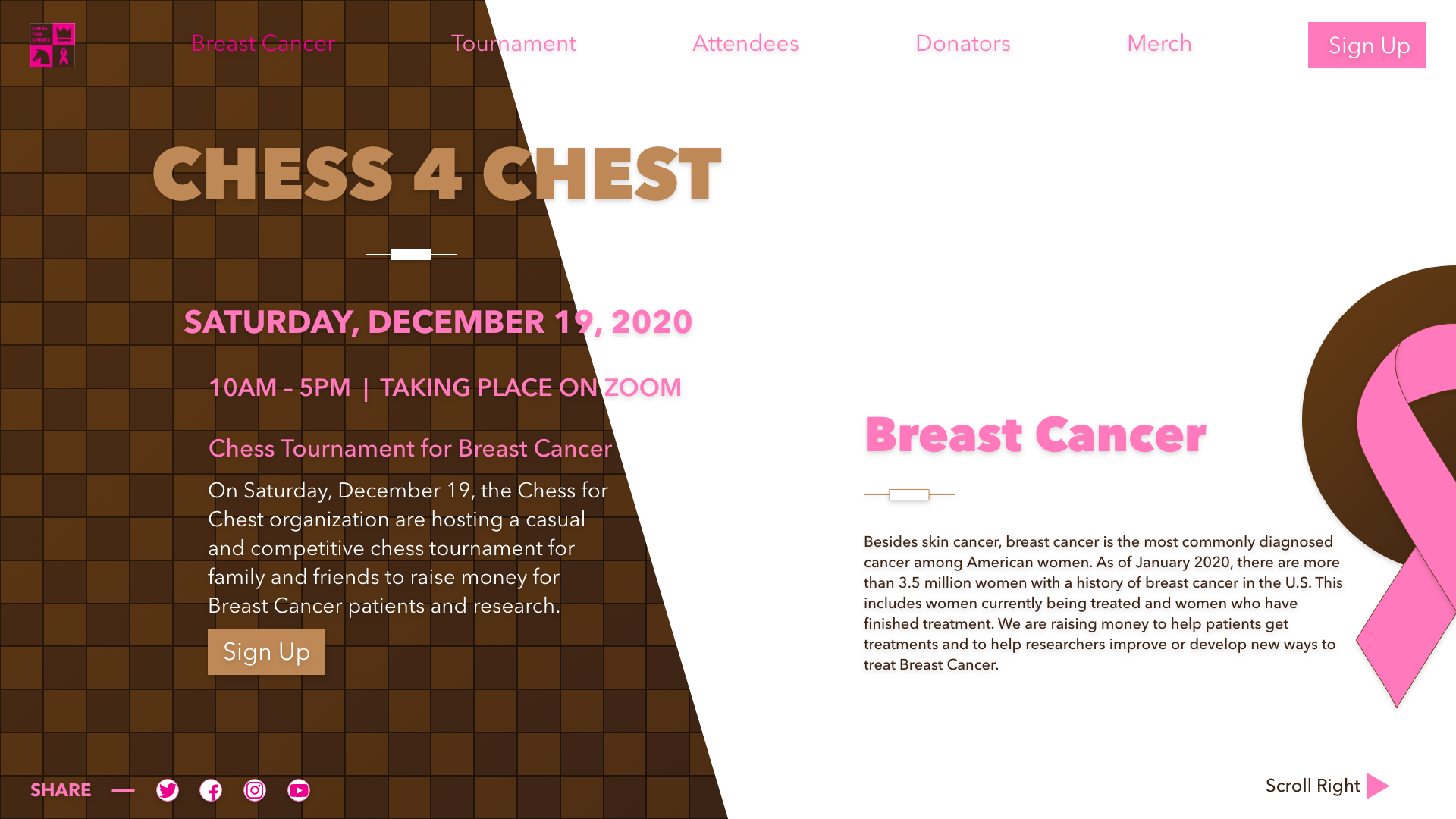
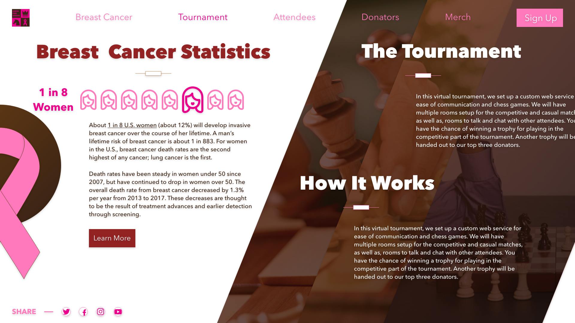
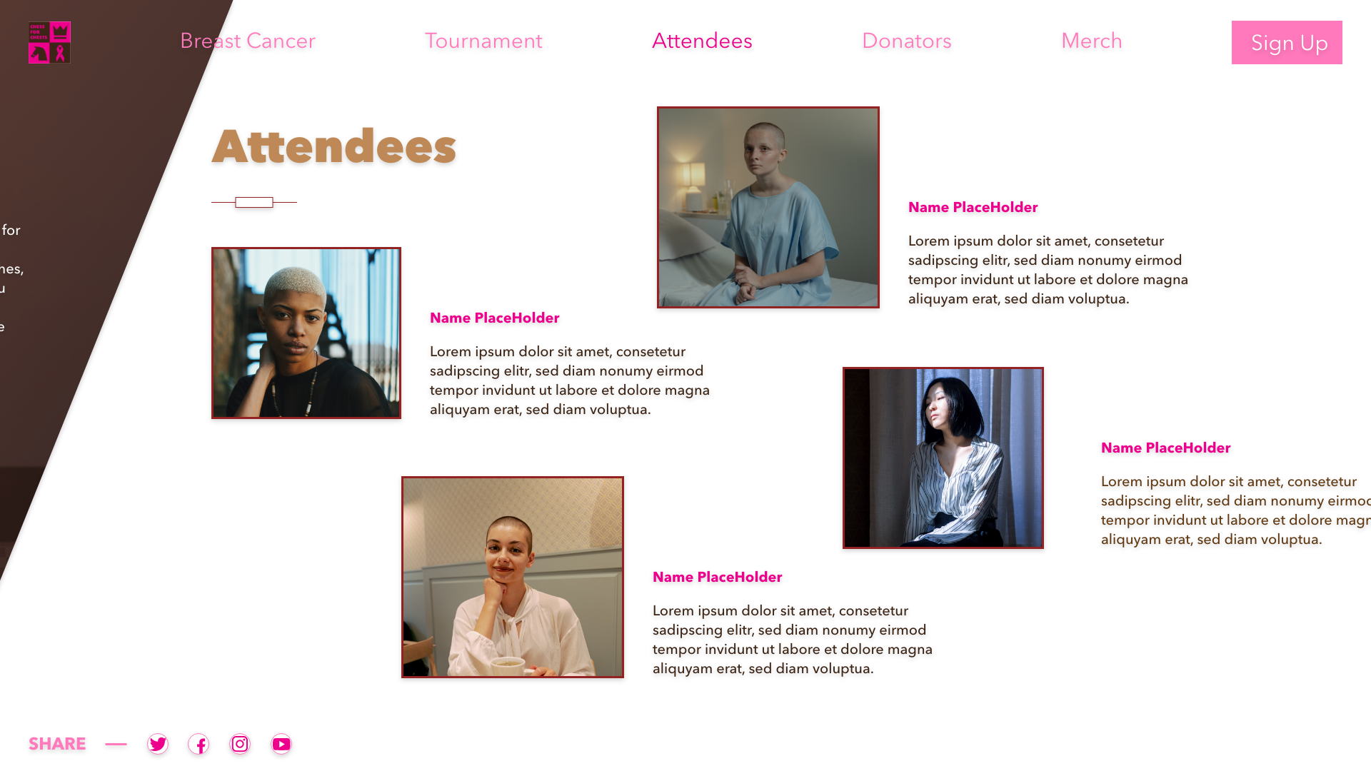
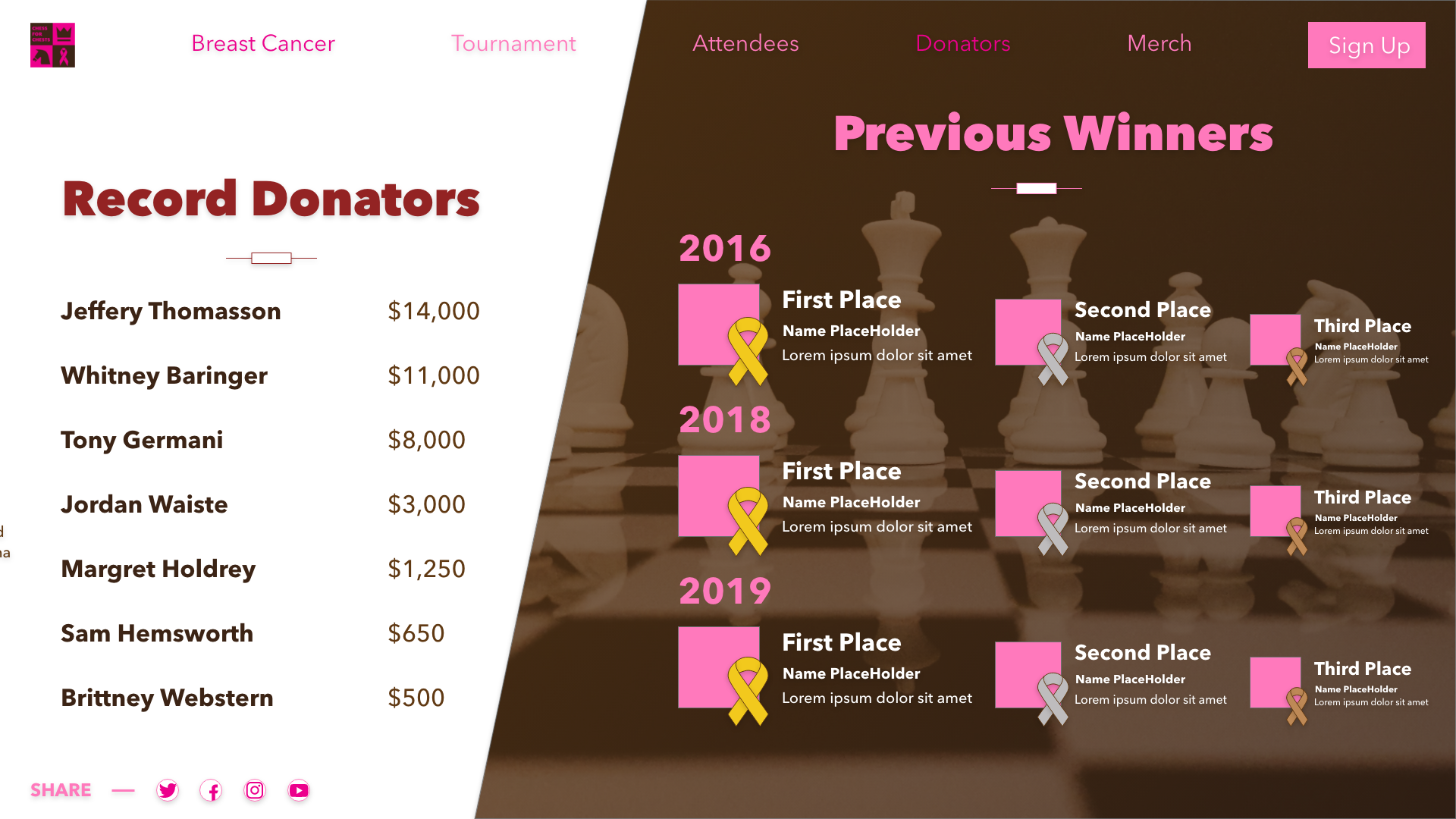
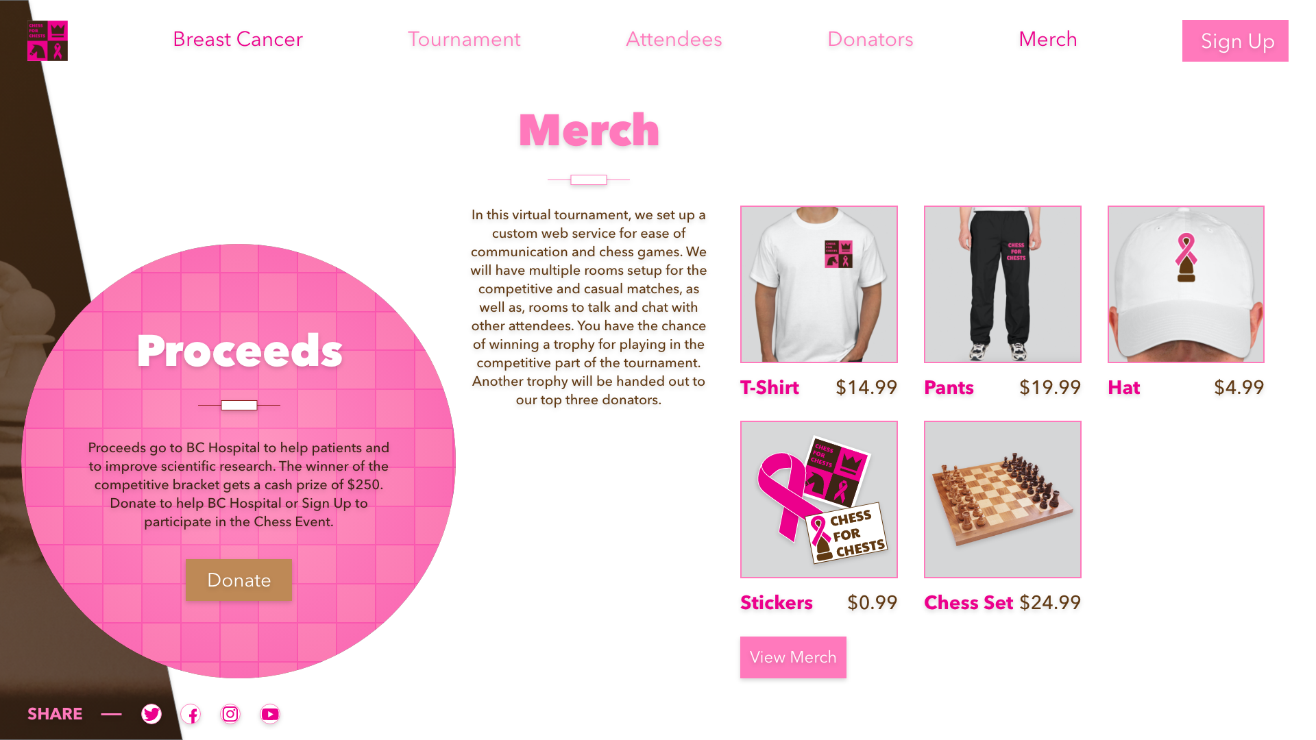
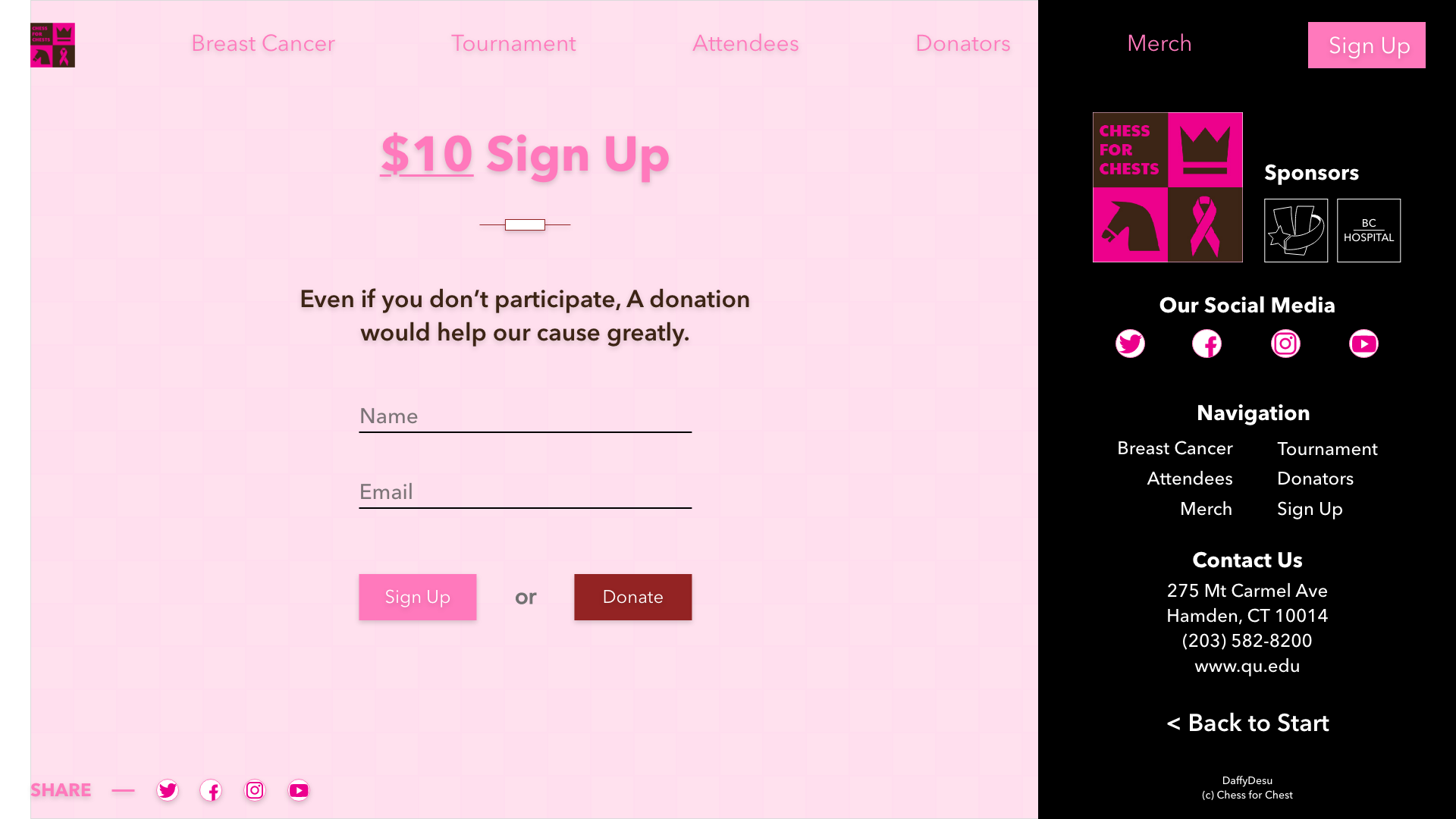
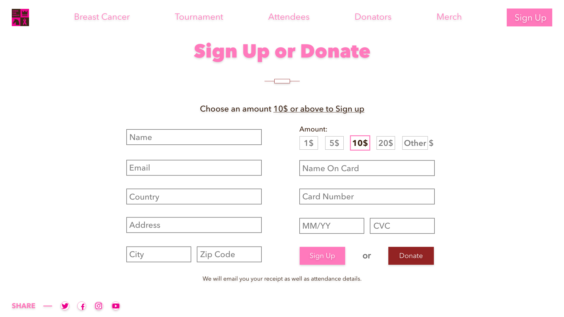
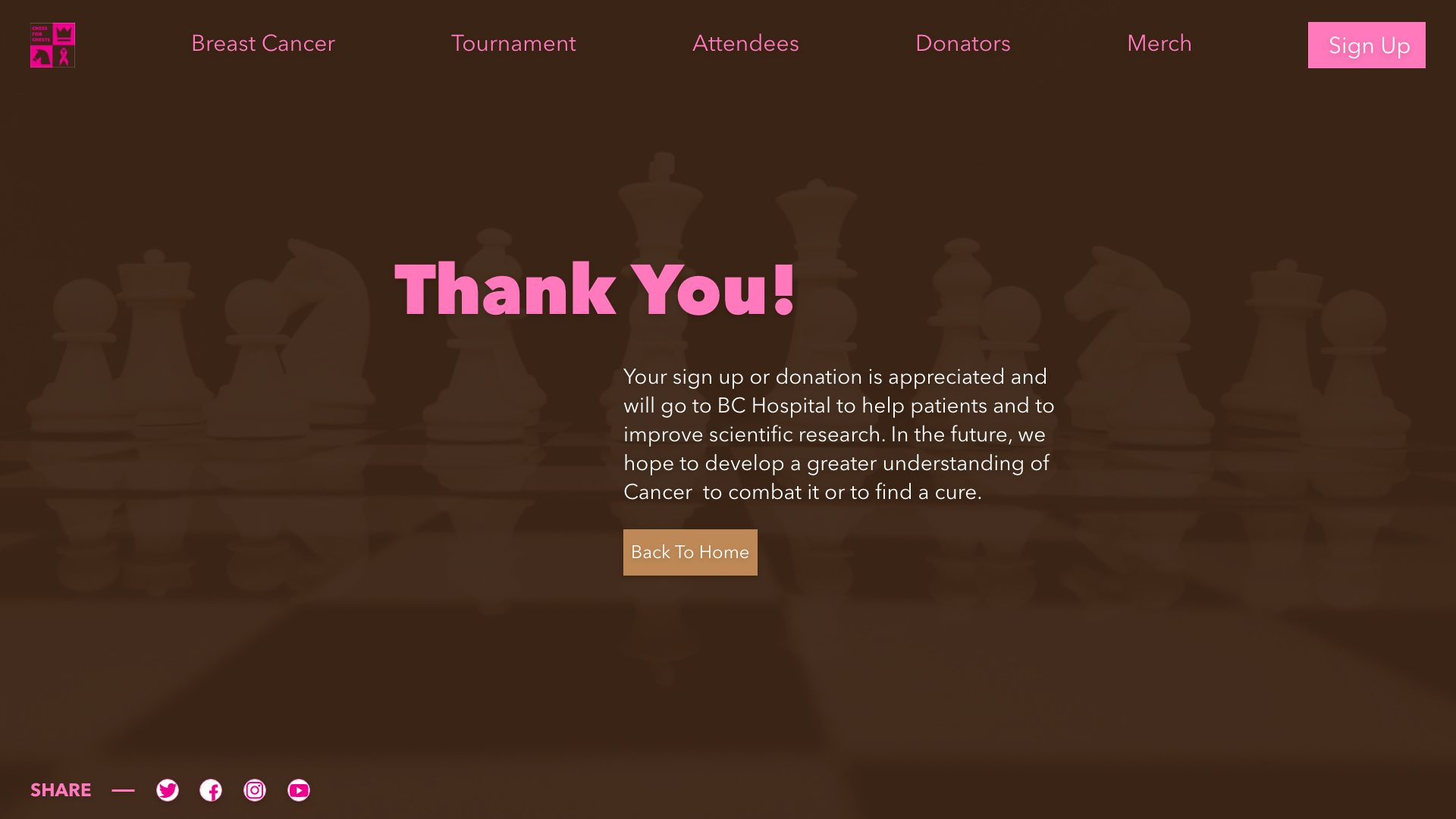
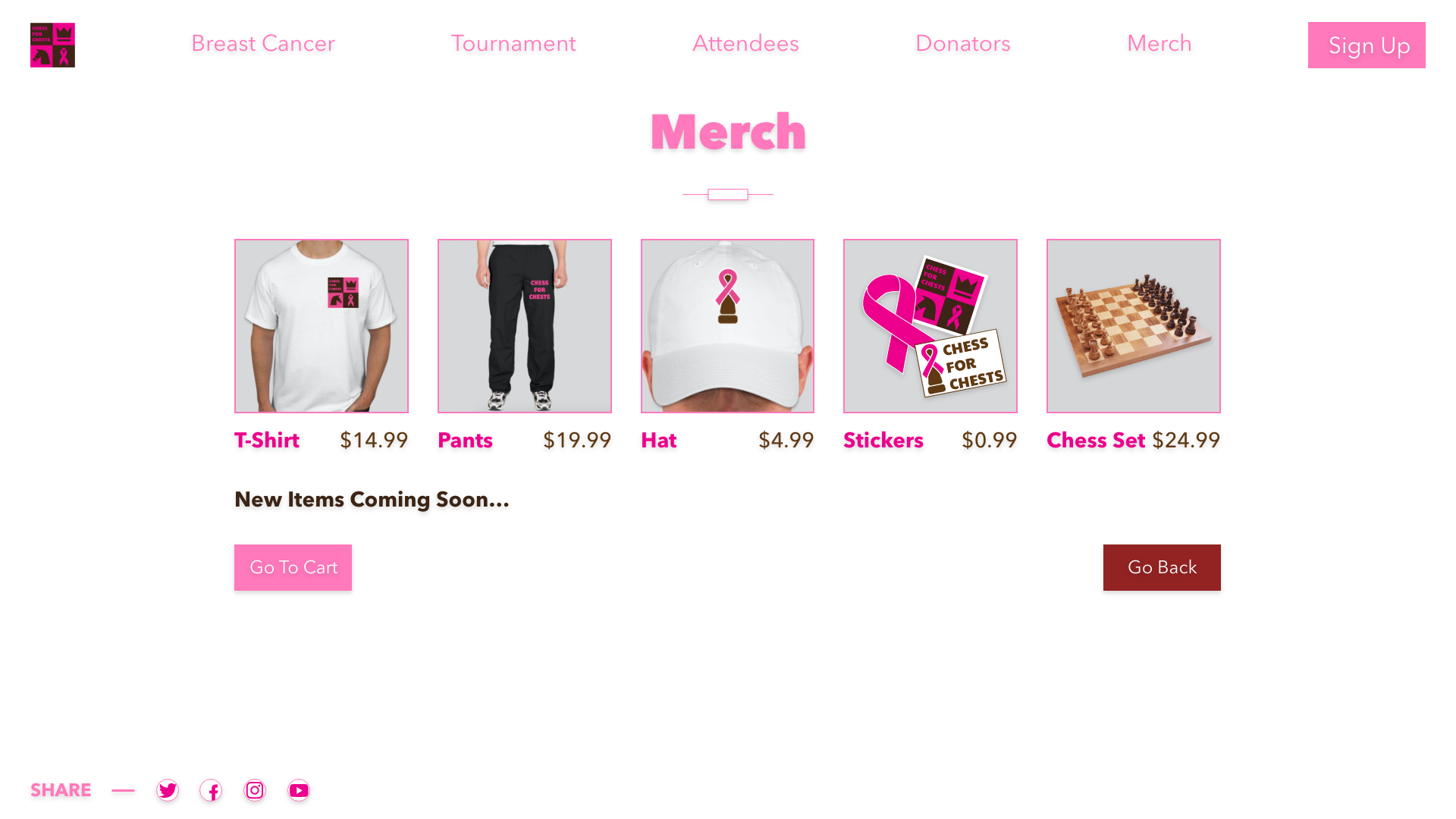
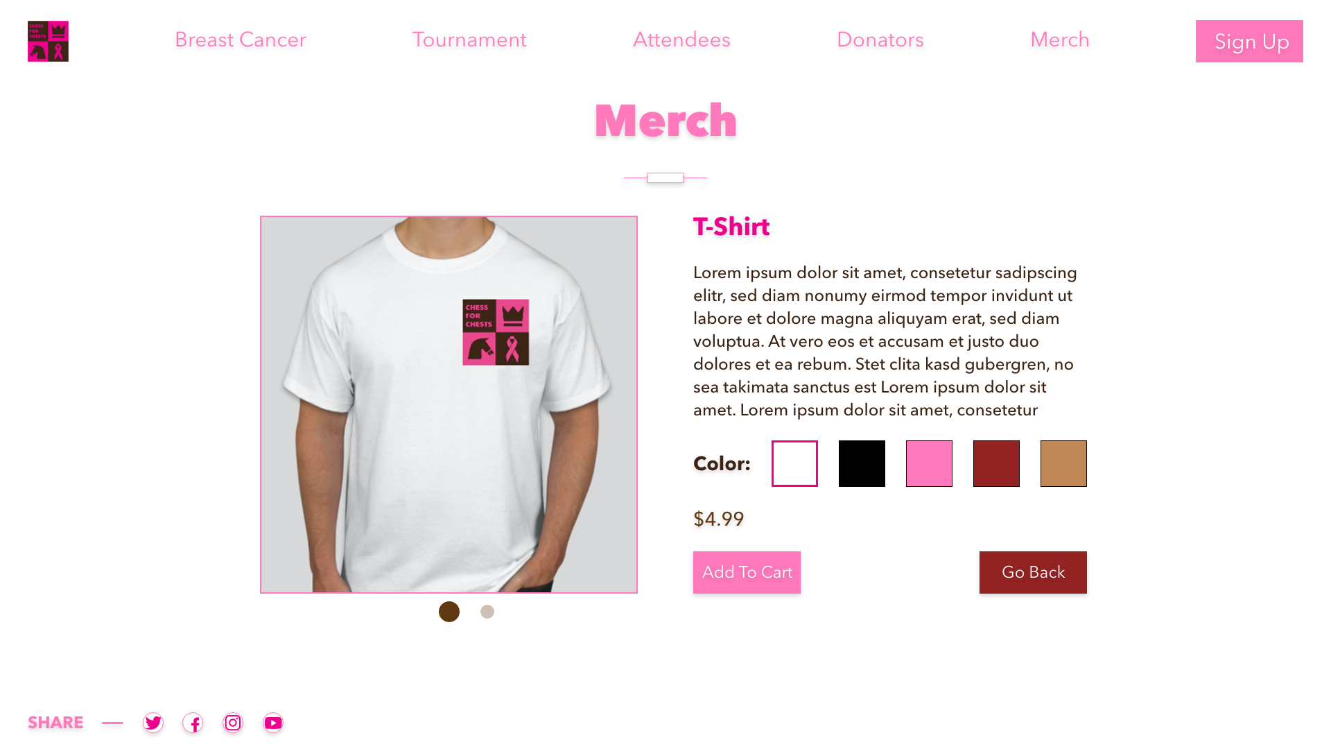
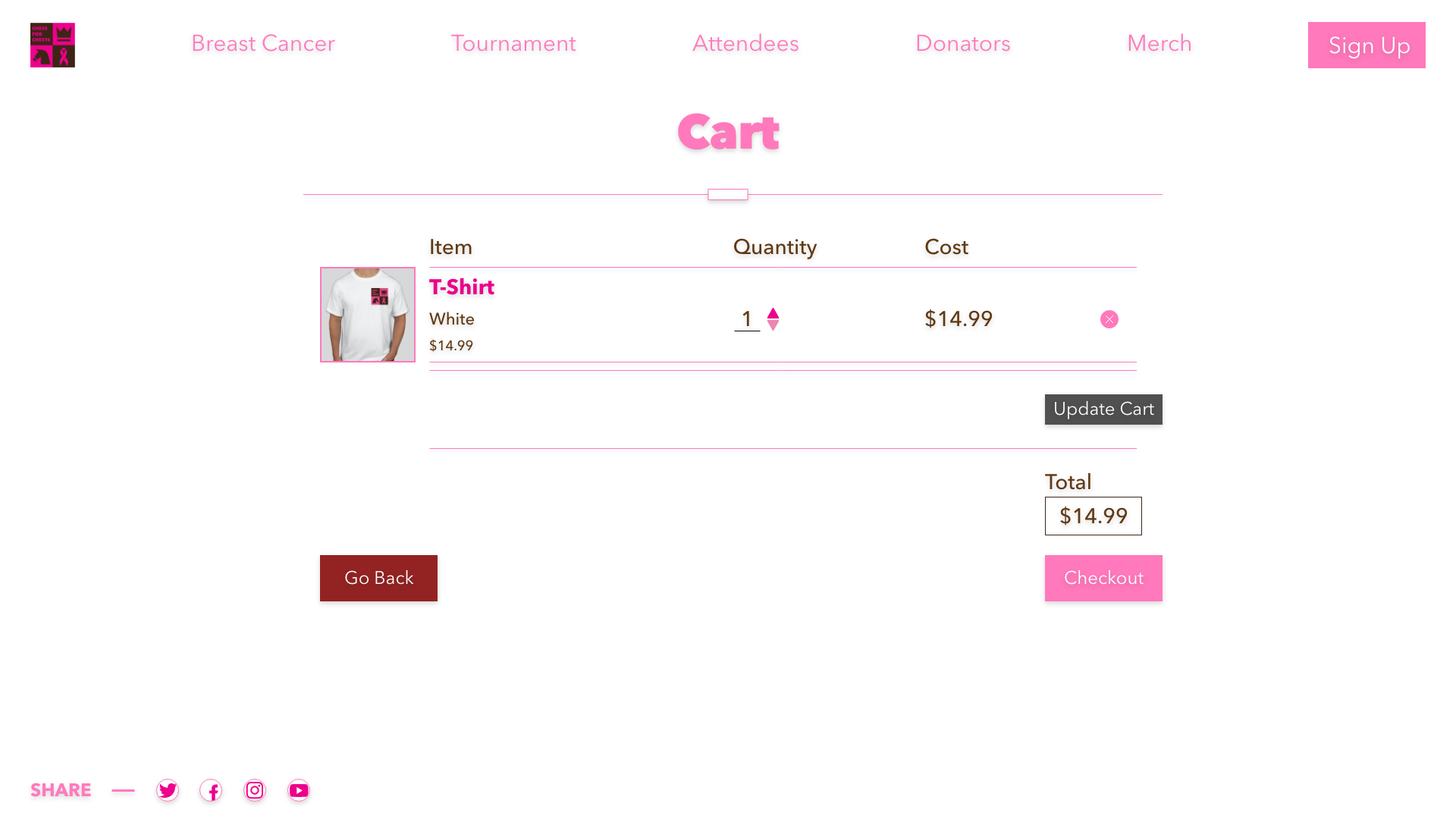
Chess for Chest is a (fictional) fundrasing gaming tournament meant to raise money for breast cancer. The tournament is meant to be virtual, so you would sign up and be put in the mailing list to get the link to participate. I focused mostly on the web structure; mockups and compositions. I worked on gathering information and research together with the group on Slack. One of my group members created the logo and the merch Items. Since we decided to with a One Page Website, I wanted to try horizontal scrolling. The links at the top of the page are anchors that will send you to that specific position. The other pages to the website are the Shop page and the Donation / Sign up page. The hardest part was finding a way to structure everything. I wanted it to seem fluid but also grid-like. Like many of the websites, social media is important to show on the website. Like the nav-bar at the top, the socials at the bottom left are fixed to the page. The adobe document should have working buttons, if they don't work for you, use the arrow keys.
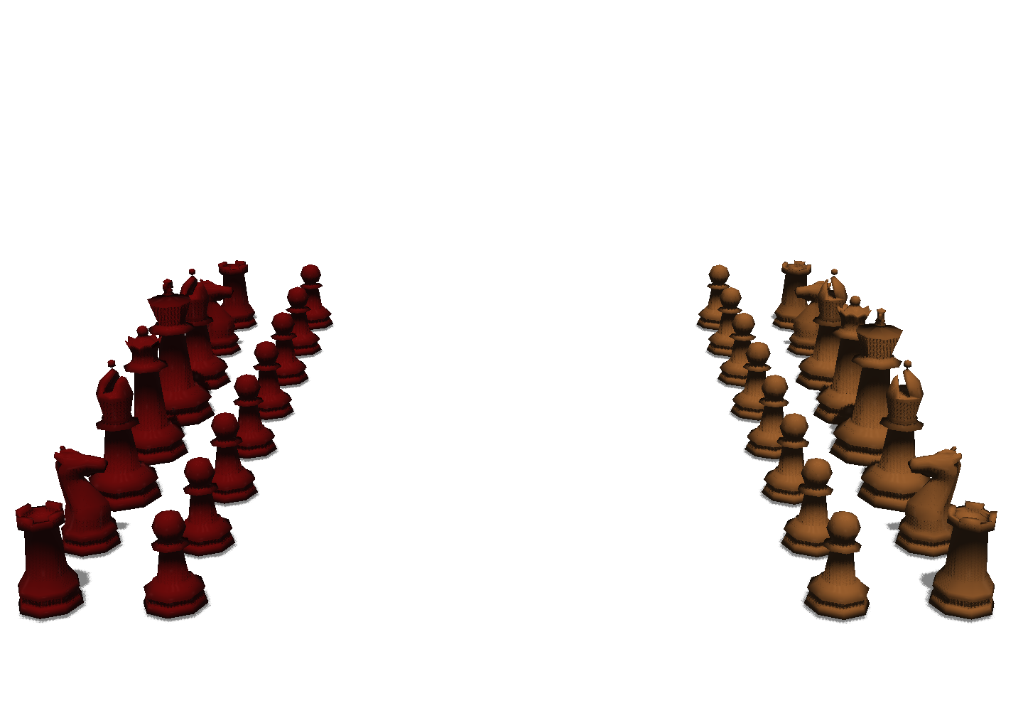
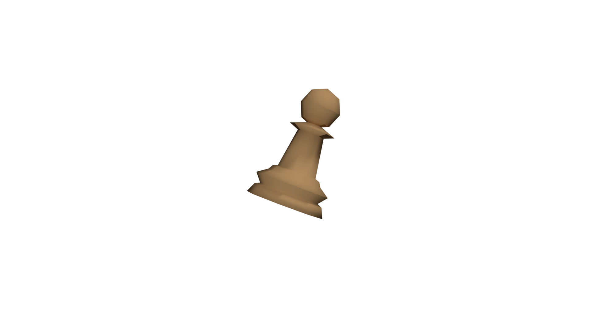
I tried my best to focus on the gaming element, however, I believe I could have done a better job. I let the other guys handle the Logos, Personas, and mood boards but I feel we should have worked together on it more. Our Process book has some themeing issues which we could have fixed if we did more or just the process book together. I used the same divider that Jay created used in the color section of the process book. One of my earlier versions used chess pieces that I made in Blender but I ended up not using them because I couldn't get them to look natural. I want to practice using 3D elements in web designs in the future just to have the skill and I'm considering learning some Three.js or just trying to use p5.js, if I can incorporate 3D elements into design more naturally. Horizontal scrolling websites are cool but for the future I'll stick mainly to vertical scroll. I think its better that way. Also, if I do something like this again, I want to focus on going through the Design Language more thoroughly like I did with this website; Color, Typography, Icons, Illustrations, Grid Layout, and Button States.


I do think the end result turned out well. For the future, I think planning what to write, explaining what the event is actually advertising, and theme are the most important. Our planning was the probably the most lacking in our teamwork. In terms of group members, I think we each had our own difficulties and achievements but I think Jay did the most. He also took the leadership role. It would have been cool if Jack visually designed the Empathy maps / Personas but I also think I could have done that since I had the time to at the end. During the project, I think each of us weren't to motivated about the website to be honest. I was all for the gaming part but incorporating it with the breast cancer was more difficult than I thought. I feel like the two conflicted with each other but it could also be due to my inexperience. I think there's a nice balance between them and we didn't quite get it. If we had more time, I wished we could improve the text of the website and matching theming in the process book.